A Personal Branding Photography Case Study
A strong personal brand can lose authority in a single second: the moment a prospective client lands on a website with a polished message and an outdated, inconsistent profile image. This personal branding photography case study follows a representative founder whose expertise was established, but whose visual presence had not caught up with the business she had built.
The details have been thoughtfully generalized, but the challenge is familiar to consultants, executives, and business owners. She did not need photographs for photographs’ sake. She needed a considered library of images that could make her authority feel immediate across the places where clients, partners, and future hires formed first impressions.
The challenge: A capable brand without a cohesive image
Our subject was the founder of a growing leadership consultancy serving mid-market organizations. Her work was high-touch, strategic, and premium. Her visual materials, however, were assembled over several years: a cropped event photograph on LinkedIn, a conventional headshot on her About page, candid phone images on social media, and presentation slides with generic stock photography.
None of the individual images were poor. Together, they created uncertainty. The photographs did not reflect the calm intelligence, warmth, or polish clients experienced in the room with her. More practically, her marketing team had no reliable image set for speaking announcements, proposals, newsletters, media requests, or a planned website refresh.
This is where personal branding photography differs from a single headshot. A headshot may establish recognition. A personal brand session should build a usable visual system: images with clear roles, a consistent emotional tone, and enough variety to support a business over time.
The founder’s objectives were precise. She wanted to appear approachable without looking casual, accomplished without becoming overly formal, and creative without drifting into a style that would feel dated next year. She also needed imagery that left intentional room for website copy, presentation headlines, and social crops.
The strategy behind the personal branding photography case study
The work began before the camera came out. A thoughtful consultation clarified where the images would live and what each channel required. Her website needed a confident hero portrait and more relaxed editorial images. LinkedIn required a direct, recognizable head-and-shoulders image. Her newsletter and social channels needed movement, detail, and visual range. Sales proposals called for polished images that would reproduce well beside concise business copy.
The creative direction centered on three qualities: composed, perceptive, and human. Those words became a useful filter for every decision, from wardrobe to setting to pose.
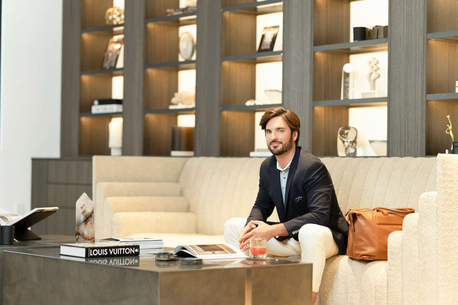
Rather than photographing her against one interchangeable backdrop, the session was designed in two environments. A refined studio setup created clean, timeless portraits with controlled light. A carefully selected office setting added context, including images of her preparing for a client conversation, reviewing notes, and moving through a bright architectural space. The result felt editorial, but still credible for corporate decision-makers.
Wardrobe was planned for flexibility. A tailored neutral suit established authority, while a softer second look introduced warmth and variety. Texture, fit, and color mattered more than trends. The goal was not to create a fashion campaign. It was to ensure the clothing supported her presence, held its shape on camera, and worked across light and dark digital layouts.
A session designed for usable assets
On session day, efficiency mattered as much as artistry. The founder had a full schedule and did not want to spend hours guessing how to stand, where to look, or what to do with her hands. Direction was clear and incremental, with attention to posture, expression, and the small shifts that distinguish an image that looks posed from one that feels assured.
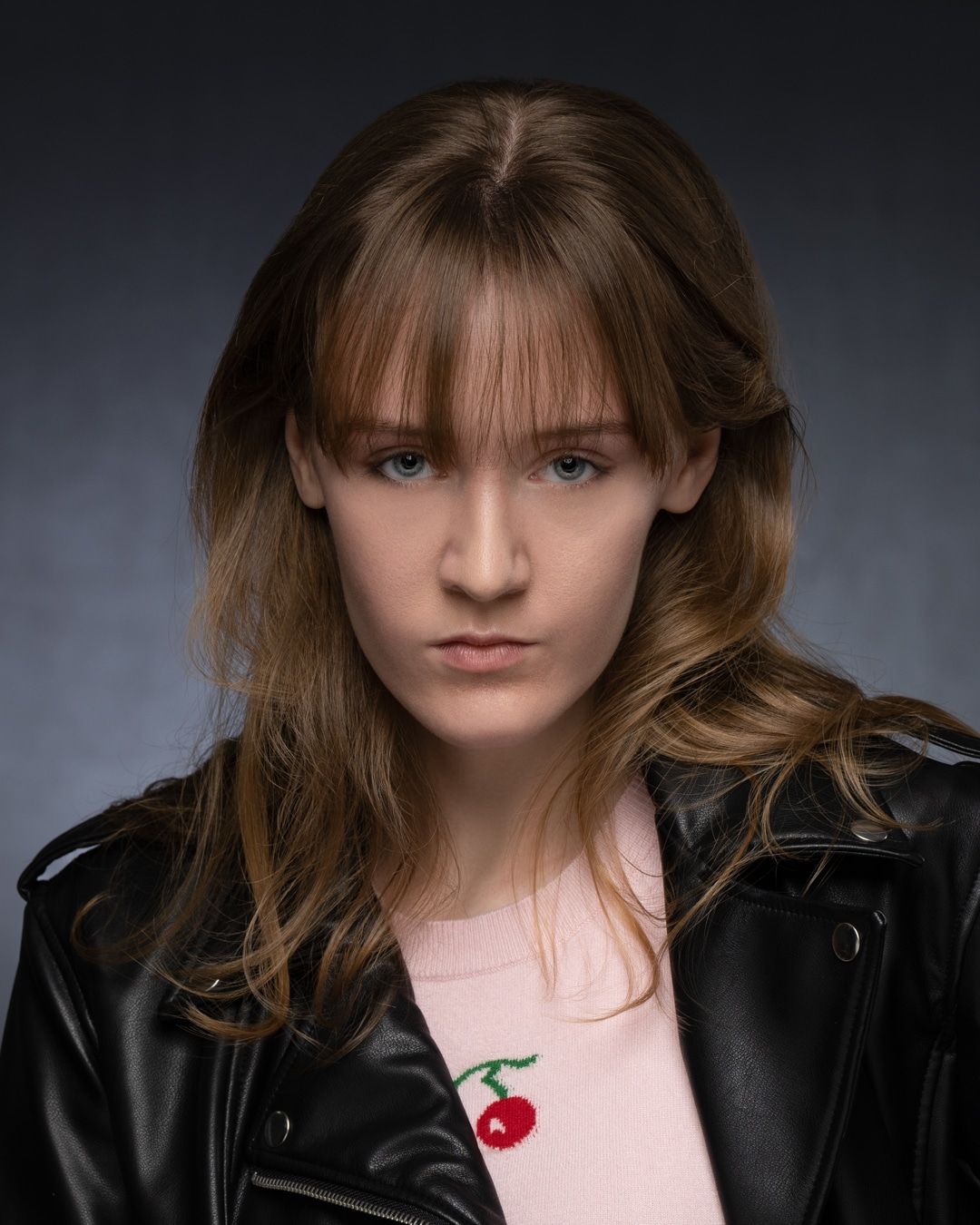
The studio portion began with the essential portraits. These were clean, direct images intended for the website, speaker materials, and LinkedIn. The background, lighting, and framing were deliberately simple so the images could remain useful as the business evolved.
Once those core assets were secured, the session moved into a more narrative mode. We created seated portraits, standing frames with negative space, horizontal compositions for banners, and close details that could support branded graphics. A few images included a notebook, laptop, and reading glasses, but props were used with restraint. They added context without turning the photographs into a staged version of productivity.
This sequencing is often the difference between an attractive session and a high-functioning image library. If every frame is a tight vertical portrait, a client may receive beautiful images that do not fit a homepage banner, an email header, or a presentation cover. If every image is lifestyle-focused, the client may still lack the strong, direct portrait that establishes trust immediately.
The right balance depends on the client’s role. A speaker may need more expressive wide shots. A financial executive may prioritize quiet, direct portraits. A creative founder may benefit from richer environment and movement. The visual strategy should follow the business, not a photography trend.
The proofing and refinement process
After the session, a curated proofing gallery made selection focused rather than overwhelming. The founder and her marketing partner reviewed the images against their intended uses, not simply by asking which portraits felt most flattering.
That distinction changed the final selection. A warm, relaxed image became the preferred choice for a newsletter introduction. A more direct portrait was selected for LinkedIn. A wide, architectural frame was reserved for the website’s hero section, where designers could place text without covering her face. Several secondary images were chosen for future articles, event promotions, and proposal materials.
Professional retouching was intentionally refined. Temporary distractions were softened, color and tonal consistency were established, and the final images retained real skin texture and expression. The purpose of retouching is not to create a different person. It is to remove visual noise so confidence, presence, and personality come through clearly.
The result: More clarity at every client touchpoint
The most meaningful outcome was not a single favorite image. It was the coherence that emerged when the new photographs appeared together.
Her updated LinkedIn profile matched the sophistication of her consulting work. Her website gained visual continuity from page to page. Speaking announcements no longer relied on whatever event photo happened to be available. Her team could create new materials faster because they had horizontal, vertical, close, and environmental images ready for different formats.
The change also improved the founder’s own comfort with visibility. Before the session, she delayed posting because she felt she had nothing polished to share. With a versatile asset library, she could show up consistently without repeating one portrait until it lost its impact.
There is a practical business lesson here. Brand photography does not replace strong positioning, persuasive writing, or excellent service. It does make those investments easier to believe. When a client sees an image that communicates care, clarity, and professionalism, the rest of the brand has a stronger foundation on which to speak.
What made the images feel authentic
Authenticity is often misunderstood as spontaneity. For professional branding imagery, authenticity is better understood as alignment. The expression, styling, environment, and final use should all reflect the person clients will actually meet.
That requires preparation, but it should never require performance. The founder did not need to become more extroverted, more serious, or more polished than she was. She needed a setting and direction that gave her strongest professional qualities room to register on camera.
For some clients, a studio session offers exactly that focus. For others, an on-location session better reflects the work: an architect in a considered space, a therapist in a welcoming practice, or a founder among the materials and people that make the business real. There is no universally correct look. There is only a visual approach that feels intentional and true to the brand.
Turning one session into a longer-term brand asset
A personal branding session delivers its greatest value when planned around future use. Before booking, identify the next six to twelve months of visibility: a new website, leadership announcement, media outreach, conference season, hiring campaign, book launch, or content calendar. This creates a clearer brief and helps determine the right mix of portraits, environments, wardrobe changes, and crops.
For teams with distributed leaders, the same principle can extend across markets. Consistent creative direction, lighting standards, proofing, and retouching can give individual personalities room to show while protecting the company’s visual identity. That combination of individuality and consistency is particularly valuable for organizations building trust across multiple offices or client-facing roles.
Your image does not need to be louder to be more memorable. It needs to be unmistakably aligned with the level of work you are ready to do next.
Ready to bring your vision to life? Let’s create images that make an impact.