Best Corporate Portrait Backdrops for Brands

A corporate portrait backdrop does more than fill the space behind a subject. It sets the visual temperature of the image before a viewer notices expression, wardrobe, or pose. The best corporate portrait backdrops make people look confident and approachable while creating a consistent, usable visual system for your website, LinkedIn profiles, recruiting materials, executive communications, and campaign assets.
For a single leader, the right background can signal polish without feeling overly staged. For a team of 20, 200, or 2,000, it becomes an essential brand-control decision. The goal is not simply a “nice” background. It is a backdrop that supports your people, reflects your organization, and holds up wherever the image appears.
What Makes a Corporate Portrait Backdrop Work
A successful corporate backdrop has three jobs: it flatters the subject, serves the brand, and works reliably across a full set of images. Those requirements often point toward restraint. A backdrop may look dramatic on a sample board yet become distracting when repeated across a leadership page or employee directory.
Color, texture, depth, and lighting all influence the result. Neutral does not have to mean flat, and branded does not have to mean a logo printed wall-to-wall. The most refined choices create separation between the subject and the background while keeping attention on the person.
Practical considerations matter as well. If portraits are being photographed on location across multiple offices, the backdrop needs to be transportable or reproducible. If your organization hires year-round, future sessions must match the original look closely enough that the team page feels intentional rather than pieced together over time.
Best Corporate Portrait Backdrops by Brand Style
Soft gray for versatile, enduring polish
Soft gray remains one of the strongest choices for corporate headshots because it is quietly adaptable. It complements most skin tones and wardrobe colors, photographs well in both light and dark treatments, and feels equally at home on a law firm website, a technology company’s leadership page, or a consulting firm’s proposal deck.
A medium or light gray can be lit with subtle falloff, creating dimension without visual noise. It also gives designers room to crop, add text, or place a portrait against other page elements. For companies that need longevity and consistency above all else, gray is often the most dependable decision.
The trade-off is personality. A poorly lit gray backdrop can feel institutional or overly familiar. The difference lies in the art direction: controlled lighting, a thoughtful tonal range, and confident posing keep the result refined.
Warm neutrals for an approachable, people-first identity
Stone, taupe, sand, and warm cream backgrounds soften the formality of a traditional corporate portrait. They work especially well for hospitality, wellness, professional services, education, real estate, and mission-led organizations that want to communicate expertise with genuine warmth.
Warm neutrals can make a team appear more connected and accessible, particularly when paired with natural wardrobe tones and relaxed but polished posing. They are also a compelling choice for personal branding portraits, where the desired impression is credible, inviting, and distinctly human.
Use them carefully if your brand palette already contains strong yellow, orange, or red tones. The portrait background should support the visual identity, not compete with it or make skin tones appear overly warm.
Charcoal or deep blue for executive authority
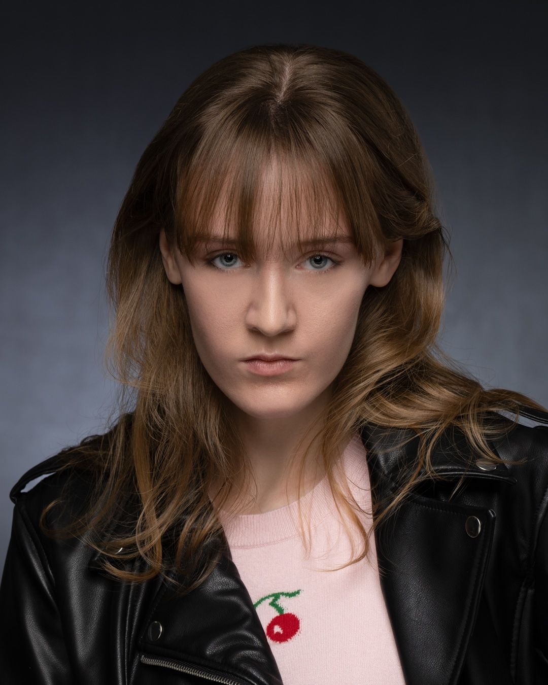
A charcoal, graphite, or deep navy backdrop introduces gravitas. It can be excellent for executive portraits, financial and legal services, luxury brands, and any organization that wants a more decisive visual presence. Darker backgrounds create natural contrast, often making a subject’s face and eyes feel more prominent.
This approach benefits from precise lighting. Without enough separation, dark hair or a dark jacket can disappear into the background. A skilled photographer will shape the light so the portrait retains depth, detail, and an elevated finish rather than becoming heavy.
Dark backdrops are not always the best choice for a large, varied employee population. They can be striking, but they require more wardrobe coordination and may feel more formal than a culture-focused employer brand intends.
Environmental office portraits for a sense of place
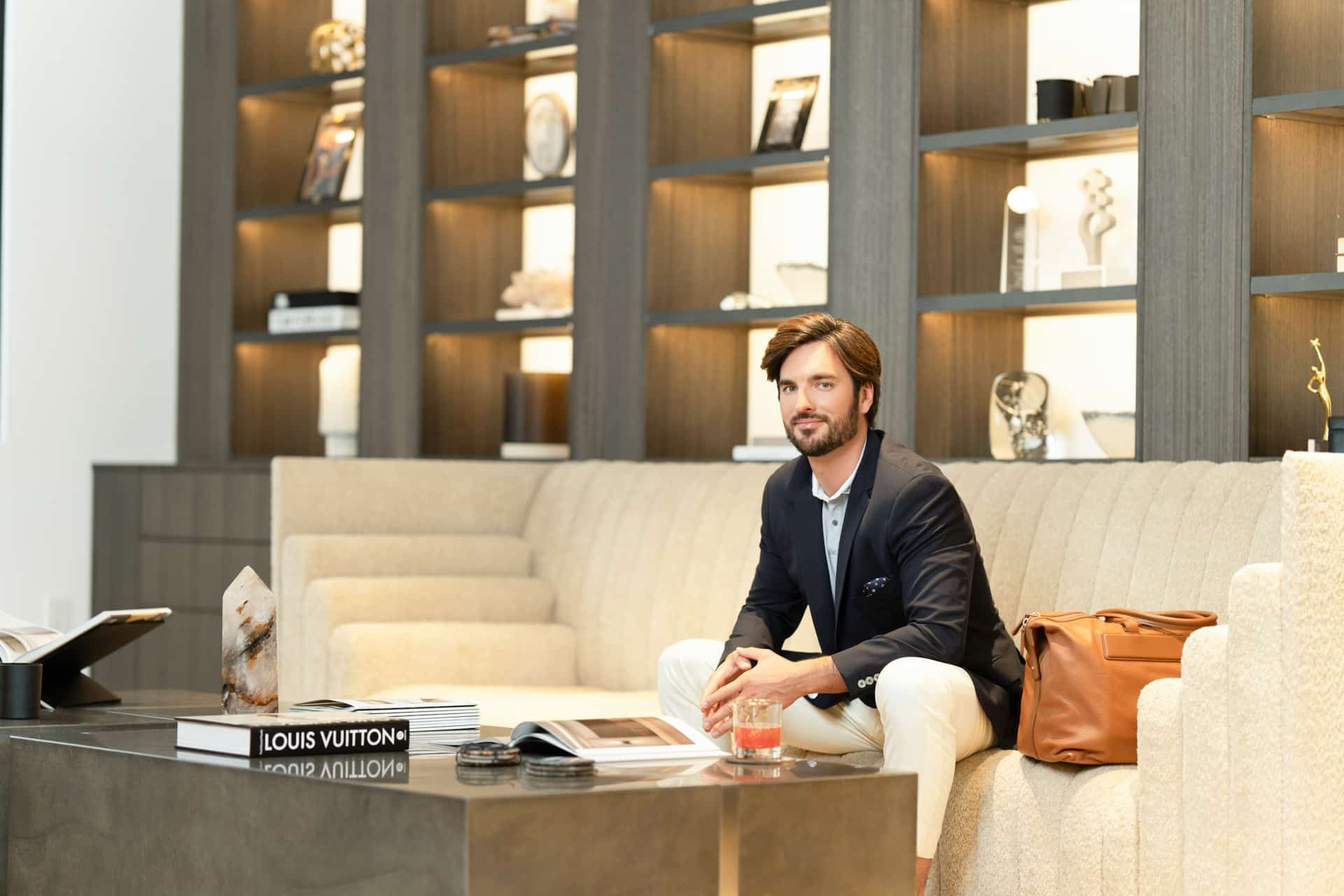
An environmental backdrop uses your actual workspace, architectural features, or a thoughtfully selected location as the setting. This can be a bright studio, an architectural lobby, a clean conference space, a city view, or a production floor. Done well, it gives a portrait context and makes the organization feel tangible.
Environmental images are particularly effective when the setting communicates part of your value: a design firm in a considered studio, a hotel group in a beautiful property, or a technology team in a distinctive innovation space. They are also valuable for editorial leadership features and marketing campaigns that need a more narrative feel.
The challenge is consistency. Offices change, daylight shifts, and different locations may not have comparable backgrounds. For distributed teams, consider pairing environmental portraits for feature stories with a standardized studio-style backdrop for core staff headshots.
Branded color for confident visual distinction
A solid background in a brand-adjacent color can make corporate portraits immediately recognizable. Muted blue, deep green, dusty rose, or a carefully selected signature hue can bring energy to recruiting campaigns, social content, and creative-company websites.
The key word is controlled. A color that is too saturated can reflect onto skin, clash with clothing, or feel dated after a short period. In many cases, a softened variation of the brand color delivers greater sophistication and broader usability than an exact logo color.
Before committing, review portraits on the channels that matter most. A backdrop that looks exceptional in a full-screen presentation may feel overwhelming when reduced to a small LinkedIn image or placed beside dense website copy.
How to Choose a Backdrop for Your Team
Begin with the intended use of the images. A team photographed primarily for LinkedIn and company bios may need a clean, adaptable backdrop with generous cropping flexibility. A recruitment campaign may benefit from a warmer or more expressive setting. Executive communications often call for a more tailored, authoritative look.
Next, look at your existing brand system. Consider your website background colors, typography, logo treatment, marketing palette, and the visual tone of your recent campaigns. Your portrait style should feel related to those elements, but it does not need to duplicate them. A restrained portrait background often gives brand colors more room to work in the final design.
Finally, plan for real people rather than an idealized sample image. Your employees will have a range of skin tones, hair colors, wardrobes, ages, and comfort levels in front of the camera. The strongest backdrop is one that gives every person a flattering, cohesive result. Test images with representative team members whenever possible.
The Case for a Consistent Backdrop System
Consistency is not about making every employee look identical. It is about giving each person an equally polished place within the larger brand. When headshots vary widely in background, lighting, cropping, and retouching, a company can appear disorganized even when every individual photo is technically good.
A defined backdrop system also simplifies future production. New hires can be photographed with the same visual standards, satellite offices can follow a clear brief, and marketing teams receive files that work together immediately. This is especially valuable for growing organizations and multi-city teams where coordination needs to be efficient as well as artful.
At Art of Portraits, corporate portrait planning begins with this wider view: how the finished image will represent the individual, the team, and the brand long after the session day. Backdrop selection, lighting, wardrobe guidance, proofing, and retouching are all part of one considered visual experience.
Backdrop Details That Can Undermine a Portrait
Busy patterns, wrinkled fabric, visible stands, harsh shadows, and overly literal office branding can quickly reduce the impact of an otherwise strong headshot. A repeated logo backdrop may have a place at an event, but it rarely creates the lasting, editorial-quality corporate portrait most businesses need.
Be equally cautious with pure white. It can look crisp and modern, but it requires deliberate lighting and careful exposure to avoid a sterile effect or lost detail around light clothing and hair. White is best when it clearly supports the design language of your brand and the image will be used in layouts that benefit from its clean simplicity.
The backdrop should never become the subject. When viewers remember the color wall but not the person, the creative decision has gone too far.
Give Every Portrait a Place to Belong
The right backdrop brings visual confidence to every face in your organization, from a new hire’s first professional headshot to a CEO’s annual report portrait. Choose a setting that feels true to your brand, practical for the channels you rely on, and generous enough to let people be seen clearly. That is where professional presence becomes more than a photograph - it becomes a coherent expression of who your organization is.
Ready to bring your vision to life? Let’s create images that make an impact.